Every day new beautiful websites are added to the internet. Webpuccino® works often together with other designers to make creative designs, but we also design many websites by ourselves. To get to creative ideas, it often helps to get inspired by other designers. There are several websites with collections of beautiful websites, like for example siteInspire and Unmatched Style. We’ve searched the internet for beautiful websites and made the following selection. Get inspired and see what’s possible with web design. If you also want such a beautiful website, you can contact us.
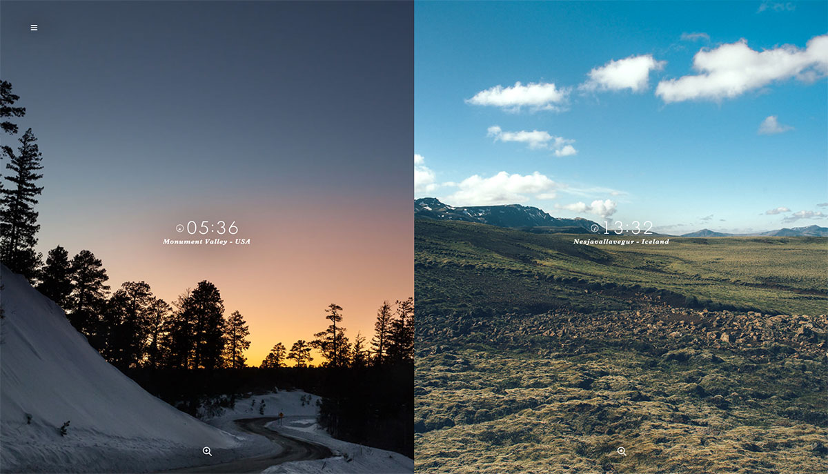
Jetlag
A beautiful photography website from two photographers who take a picture at the same moment at different locations. Besides fantastic pictures, this website is very beautiful because of the fancy animations and the ability to navigate website with the arrows of the keyboard. (http://jetlag.photos/)
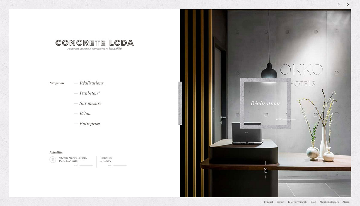
Concrete LCDA
Just like many concrete constructions, this website is also very tight and square. However, the beautiful animations make sure that this is not a boring website. The menu has a prominent place on the homepage and neatly reduced to the side of the following pages. Furthermore the website has stylish typography and a clear portfolio. (http://www.concrete-beton.com/)
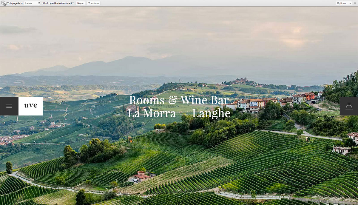
Uve
When you enter the website of this hotel, you would immediately think that you’re in Italy. The beautiful pictures and stylish fonts give the website a graceful look. Because the most important information is all on one page, you quickly get an overview of what the website has to offer. (http://www.uve.info/)
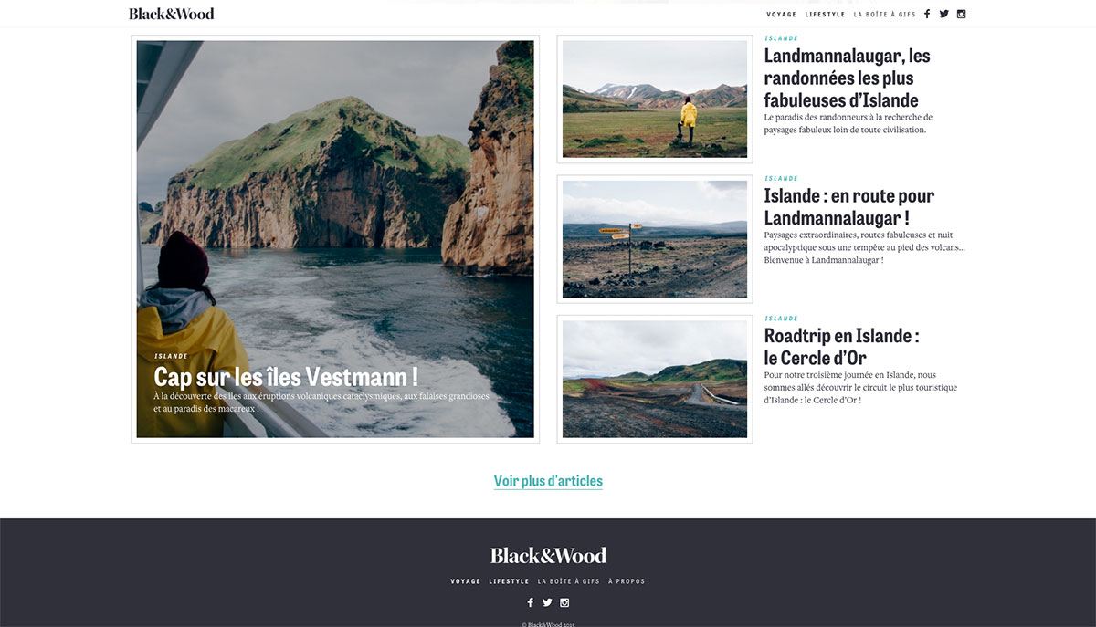
Black&Wood
This lifestyle website has a lot of articles, but presents it in a nice clear way. Pictures and texts are well balanced, what makes sure that also the pages with longer stories do not become boring. (http://www.blackandwood.fr/)
Sutro Management Group
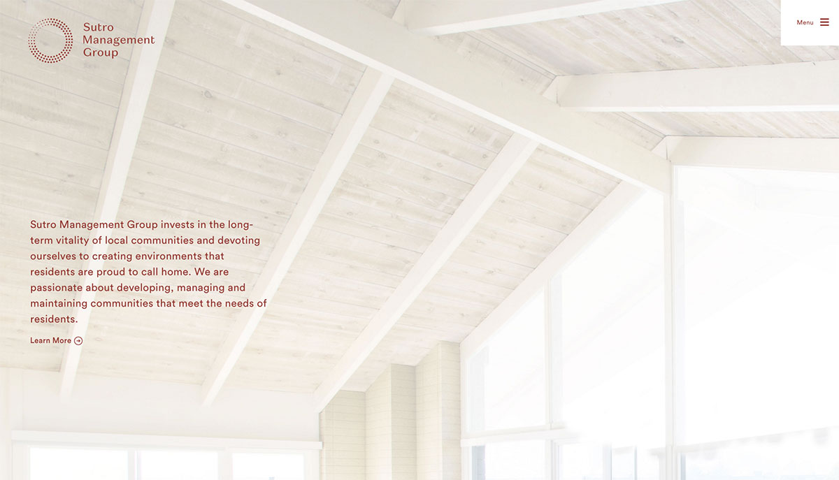
This website jumps out, because the information is very straightforward and accessible. A short introduction with a nice background, an overview of the team and below a portfolio. The menu is well reduced to a button in the right corner to not take in too much place, but to still be accessible. (http://sutromanagement.com/)
Inspiration Voyage
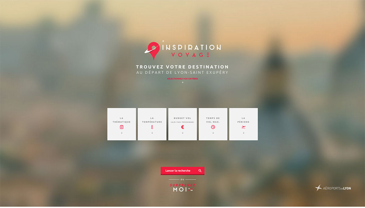
This is a website that makes it very easy to find a vacation destination. With five big blocks you can filter all the destinations, after which you get a nice overview with many pictures. The main strength of this website is the user-friendliness. The filters are easy to set and with with great use of icons everything is very clear, even if you don’t speak the language. (http://inspirationvoyage.hellotrip.fr/)
Masi Tupugunto
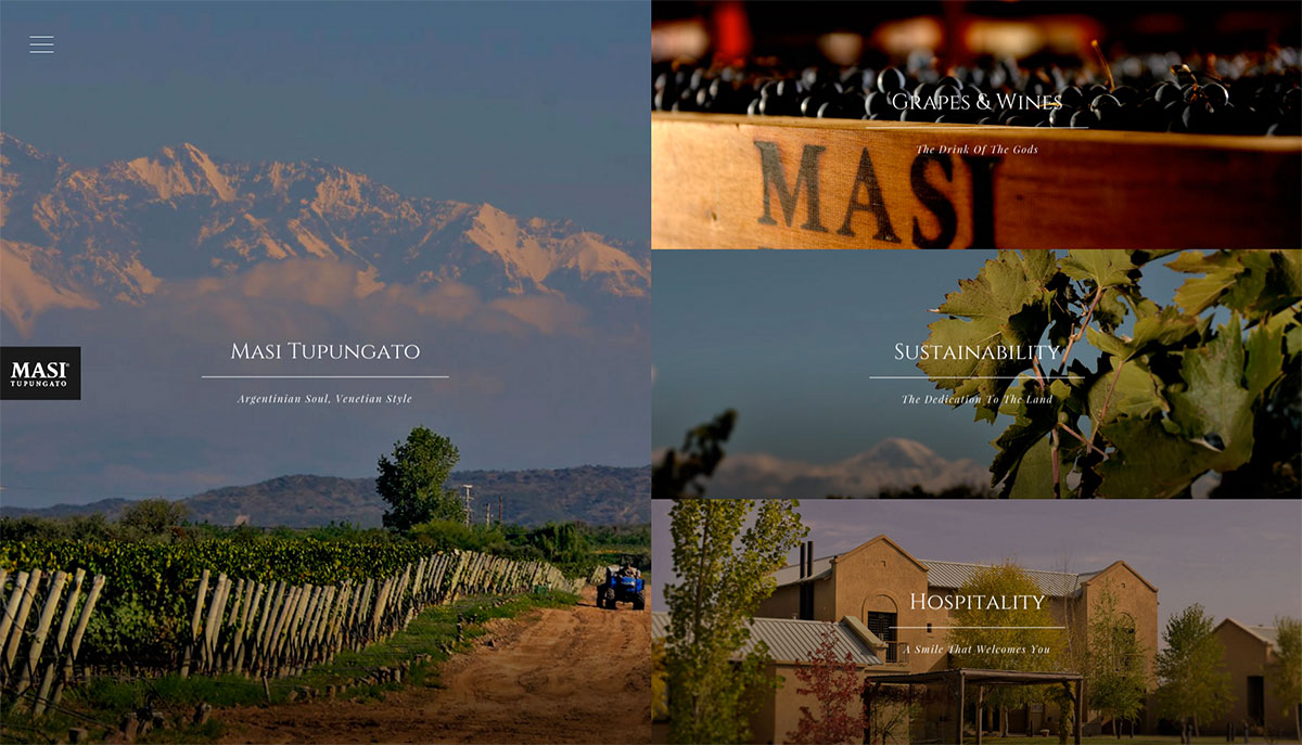
Just as the website of Uve, this website also uses great photography to make you feel like you’re at a different place. This time it’s in Argentina. The website of this winery is well designed with screen filling pictures and short accompanying texts. (http://www.masitupungato.com/)
HEAT Architecture
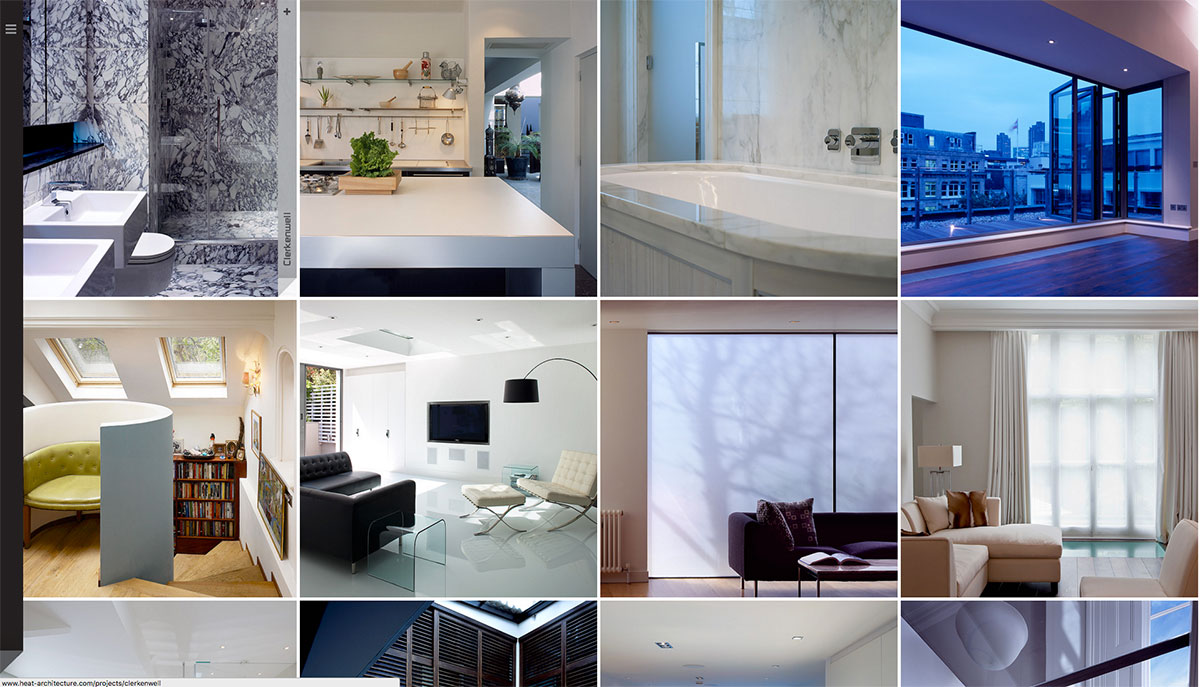
This website offers you a very nice way to quickly see the portfolio of these architects. Simply scrolling down loads new pictures in a nice and calm way. To go to the other pages, there is a neat, well designed menu on the left side. (http://www.heat-architecture.com/)
Thibault Pailloux
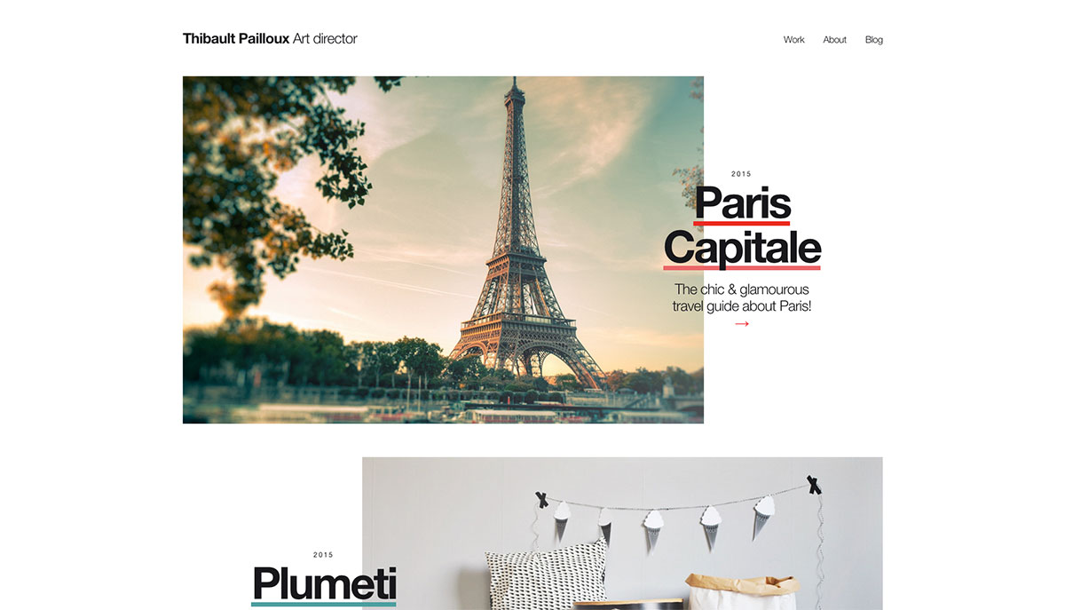
The minimalistic design of this website shows in a clear way the work of this art director. When you move your mouse over a project picture, it’ll show you a screenshot of the website of that project. (http://www.thibaultpailloux.com/)
The Mark Hotel
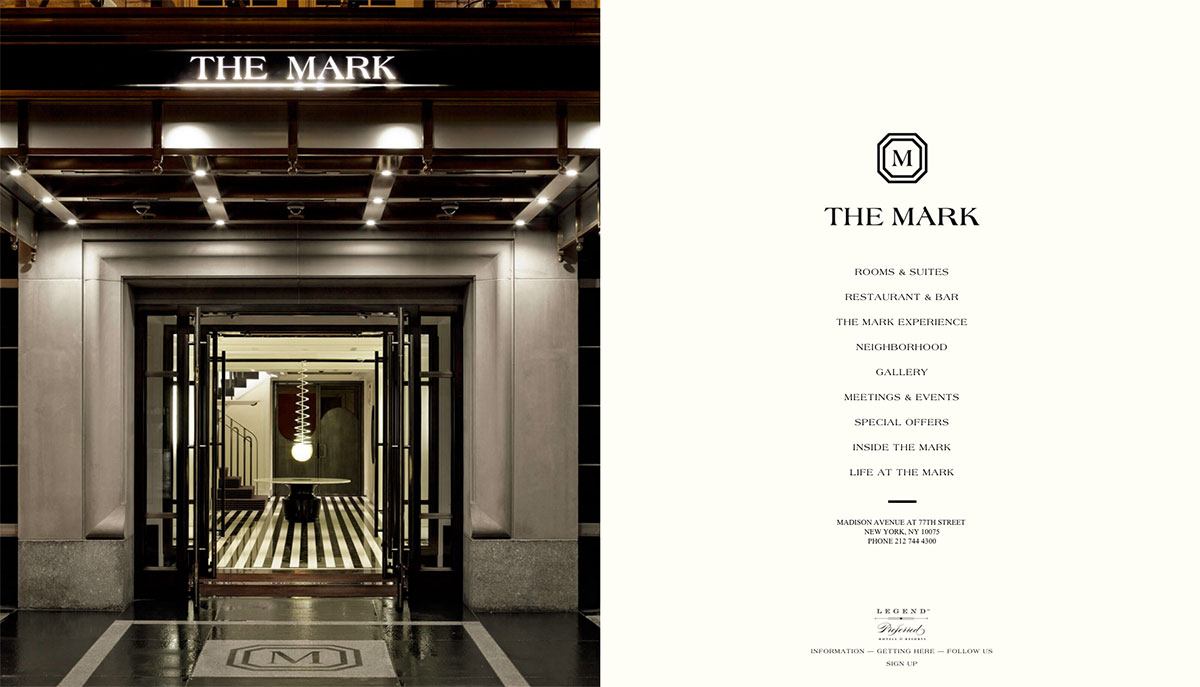
The typography, precise design and quiet animations give the website of this five star hotel a very upscale appearance. The menu folds beautifully open from the left side, which allows the rest of the website to use the full height of the screen. (http://www.themarkhotel.com/)
Olson Kundig
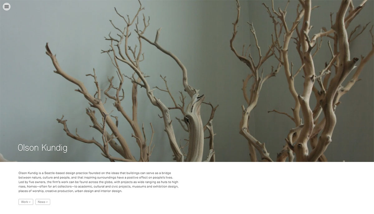
This website opens with a full-screen video which gives an impression of the work of these architects. Like seen at other websites, also here the menu is well cleaned up on the left side and jumps up with a click on a button, allowing you to navigate to other pages. Use of big pictures and a tight layout fit this architecture business very well. (http://www.olsonkundig.com/)
Chris Roberts
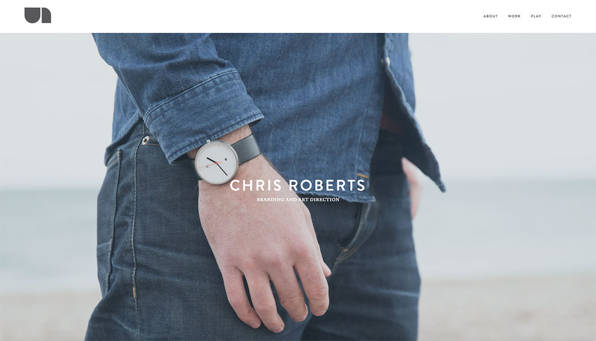
Often minimalistic websites give the best overview and are easy to navigate. Also the website of this designer. The website opens with a peaceful picture and a basic menu on top of the page. The two section blocks below the main picture allow to quickly navigate to work and fun projects. The well chosen typography makes this peaceful design complete. (http://www.thisisuncoated.co.uk/)
KFC
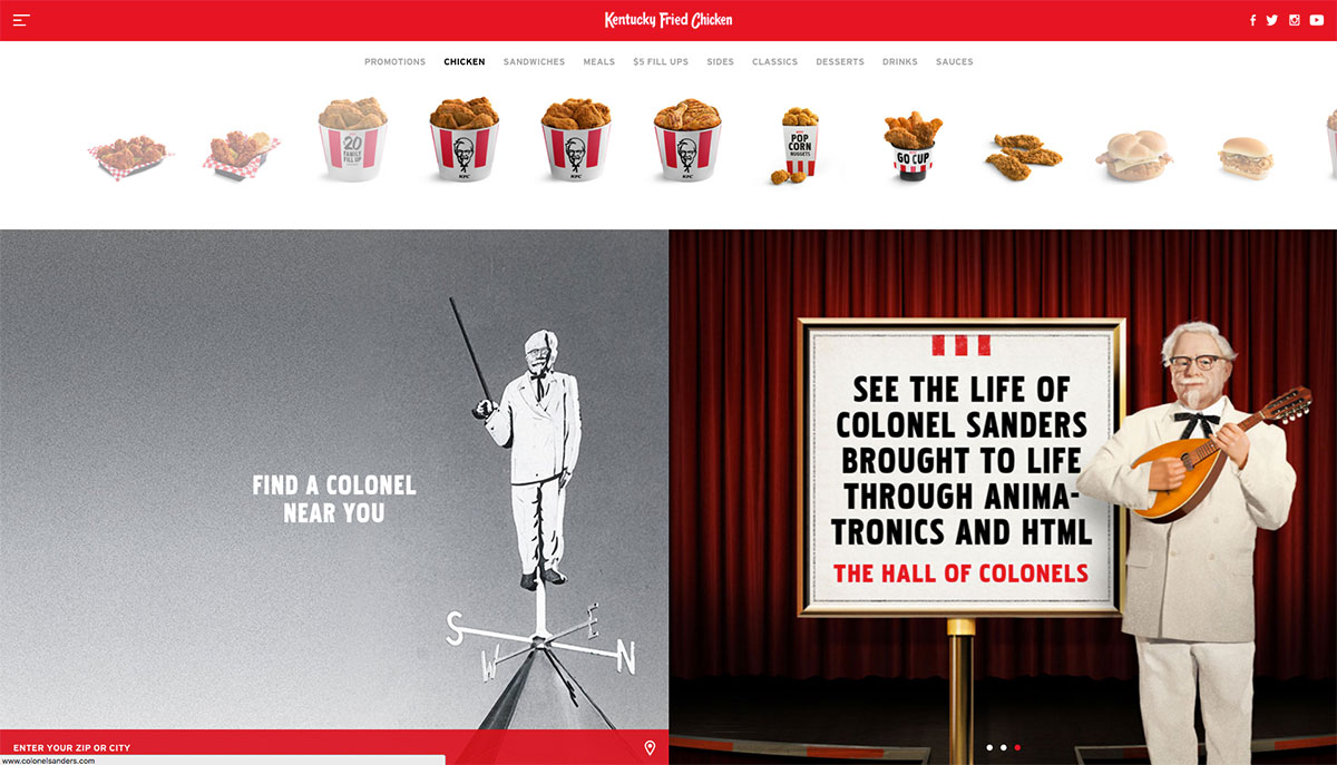
The website of KFC jumps out with a big horizontal slider with products on top of the website, which allows you to scroll easily through all the products. Clicking on a picture brings you to the product page with more info. Everything in this website is very neat designed: the square pictures and videos on the homepage, the red menubar on the top and the collapsed screen filling menu. Because all buttons are written in capitals, these also become part of the tight, checkered design. (https://www.kfc.com)
Cereal
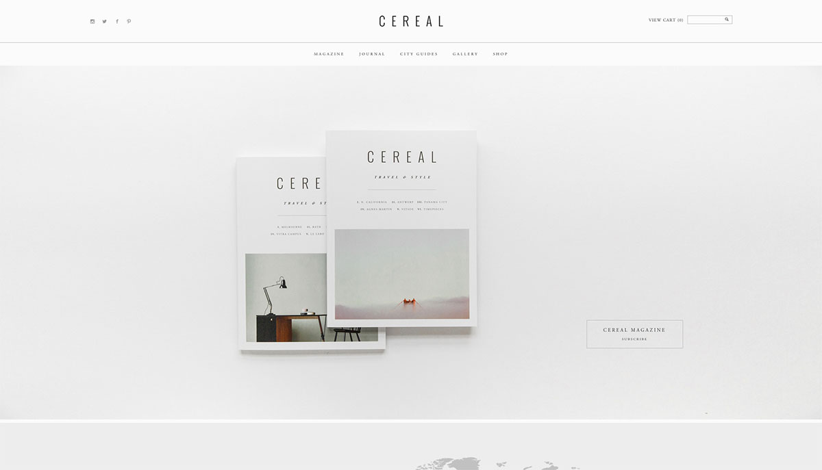
The website of this magazine has a calm and sober appearance. Because everything is designed in shades of gray, pictures stand out more and it also gives the website a very quiet atmosphere. Also with this website, minimalism causes a clear oerview. (http://readcereal.com/)
Gaucho Restaurants
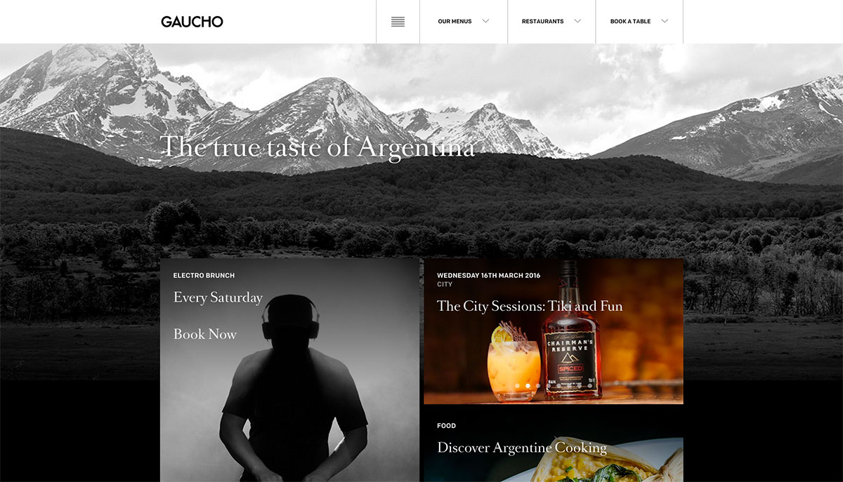
This website combines good photography with big text blocks and gorgeous typography. This makes the website very readable and gives you the idea that you’re reading a fancy magazine. Also well thought of is the block in the right bottom which allows you to make a reservation in a descriptive way. (http://www.gauchorestaurants.co.uk/)
Norm Architects
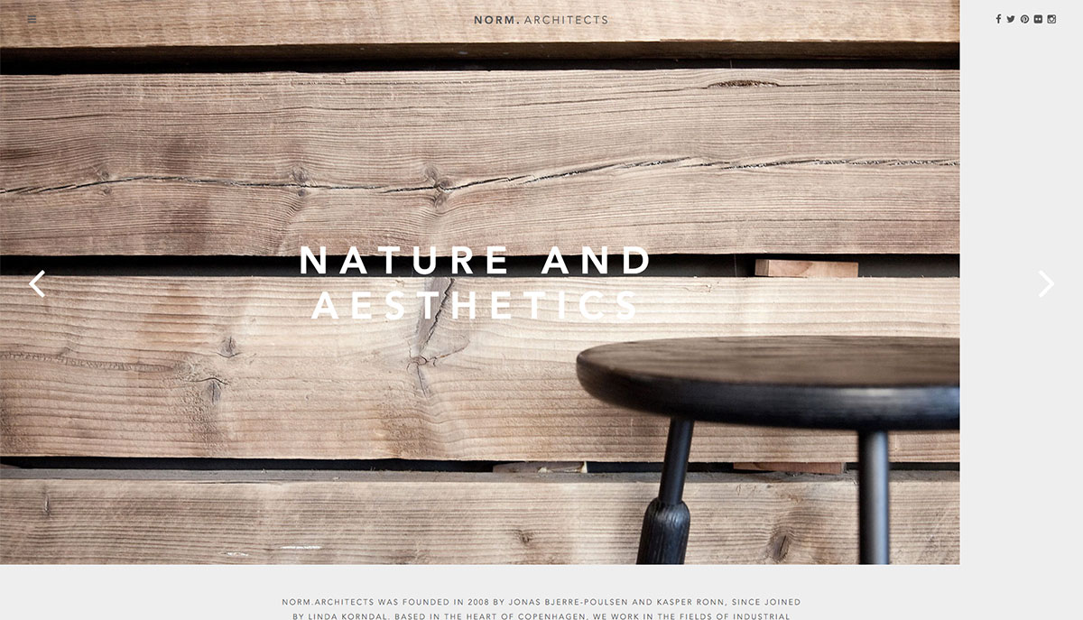
Websites of architects are often tight designed and so also this one. The homepage gives an overview of the portfolio in a style like Pinterest, but then in a more calm style. The absence of color also gives this website a quiet appearance. (http://normcph.com/)
Haswell Travel
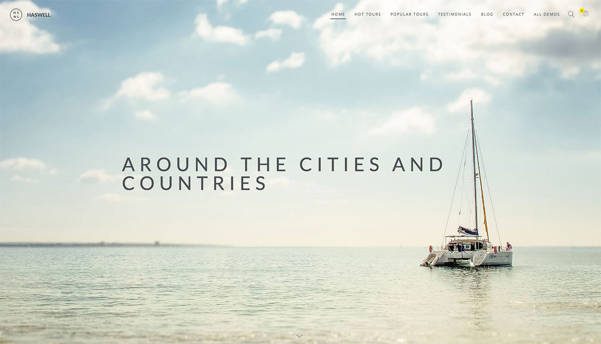
This is a template for a travel website that opens with a beautiful large picture overlapped by the menu. The big blocks with pictures and prices give a clear overview of what the website has to offer and invite to be clicked on. When you scroll down, the menu comes forward with a white background and a drop shadow. (http://demo.cmssuperheroes.com/themeforest/wp-haswell-travel/)
Block16
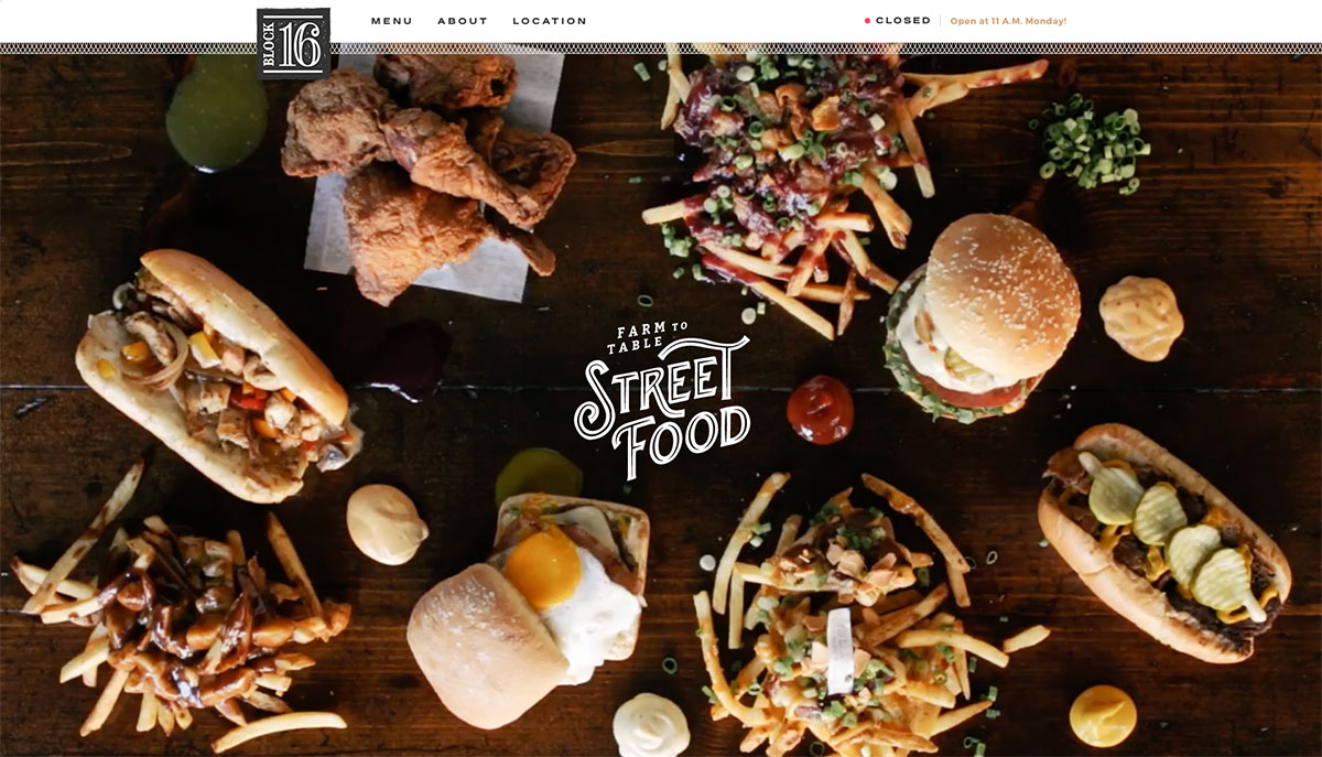
When you go to this website, you immediately get an appetite. The website opens with a large video of a table full of snacks. You have to be fast though, because everything gets eaten pretty quickly. It’s handy that on the top of the page it shows if the restaurant is open at the very moment and until what it’s opened. (http://block16omaha.com/)
Kittie’s Cakes
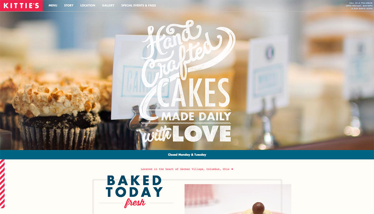
This website shows a good design doesn’t need to stay inside the lines. The headings break through the borders, but they do so in a way that it’s still pretty. Furthermore this website jumps out because of its special fonts and beautiful color combination of red and blue. The neat designed menu on top of the page gives this creative design a strong fundament, making sure it’s not a chaos. (http://kittiescakes.com/)
Moonshine Grill
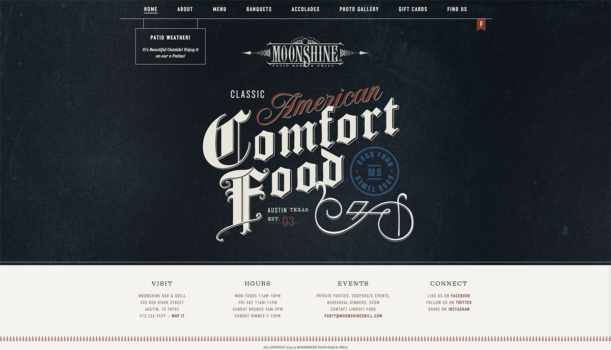
Typography is very important for bringing the right atmosphere. You can also see that with this website. Immediately you get an impression of the kind of restaurant this is. For the rest, the website is clear and plain designed, you can find easily what you’re looking for and in particular the menu page is very well designed, clearly presented. (http://moonshinegrill.com/)
Tom Cole Archictecture
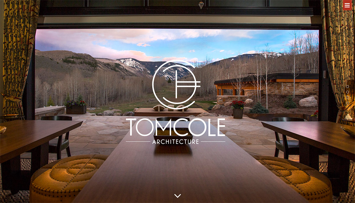
When you scroll through the website of these architects, it feels like you’re behind the drawing table yourself, because it looks like the headers are written down by hand. Furhermore with a combination of drawings and pictures this website offers a nice impression of what these architects have to offer. (http://tomcolearchitect.com/)
Pure Fix Cycles
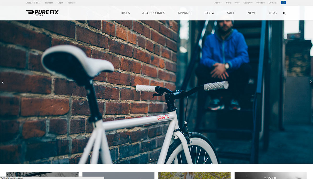
This is a really clear webshop for bikes. Because all products are placed on a white background, they seem to jump of the page. With this, minimalism is also an important player on this website. With a view clicks you can choose which bike you want, in which size you want is and with how many gears and you’re ready to checkout. It cannot be much easier than this. (https://www.purefixcycles.com/)
Guidebase
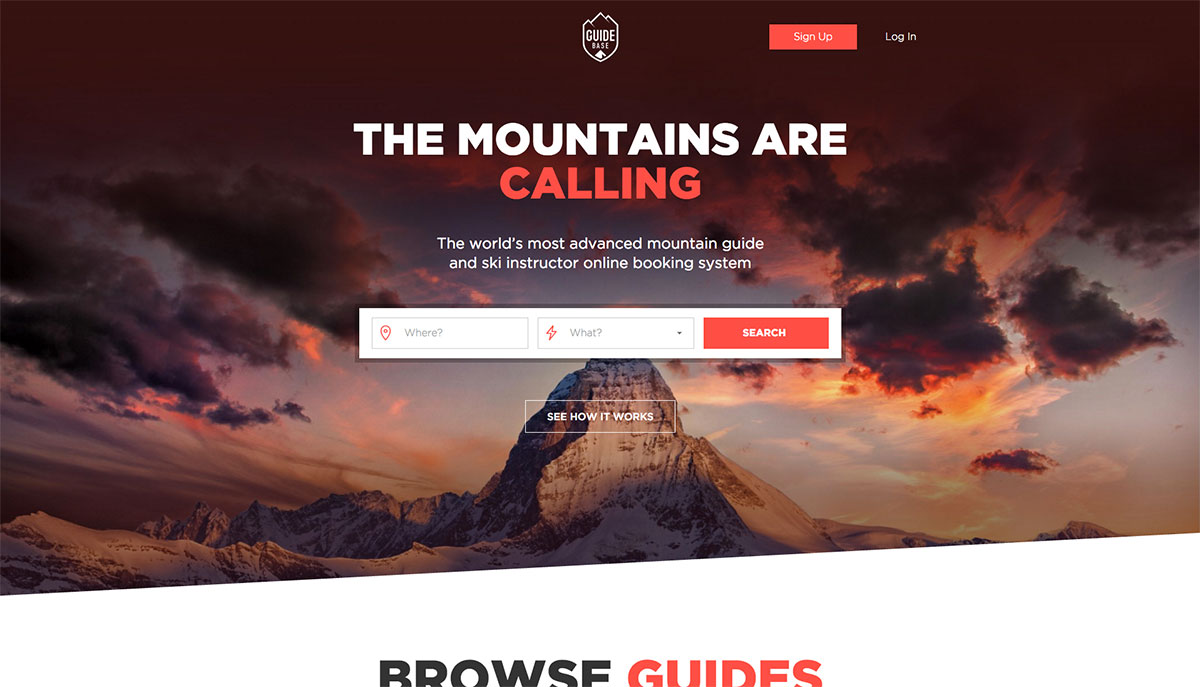
This website has looks a lot like Airbnb. Straight on top of the website you can search for a mountain guide or ski instructor. Everything is set up with big buttons, which makes it easy to click through the website and gives everything a clear overview. This is a good example of a very user friendly website. (https://www.guidebase.com/)
Circle
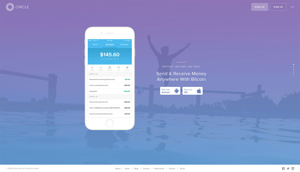
Just quickly scrolling through this website explains in a few seconds what you can do with the Circle app. Because the background color and images change when you go down, you’re invited to scroll further. While scrolling, the screenshots in the phone are adjusted to support the text. In the small bar on the bottom the copyright text, the menu and the social media icons are nicely brought together keeping the design very basic. (https://www.circle.com/en)
Risen Church
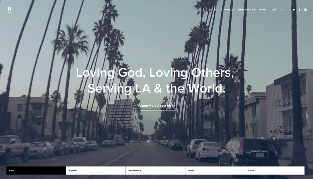
The website of this church has a very active appearance, caused by the screen filling background video on the homepage. Because every block below only contains a big picture with header and link to more info, it’s at the same time also a very peaceful website. The plain menu bar on the bottom clearly shows at which part of the homepage you are, while the menu on top of the website allows you to navigate to the different pages. The stylish font and lots of whitespace on the following pages make the website very readable. (http://risenchurch.com/)
Artifact Uprising
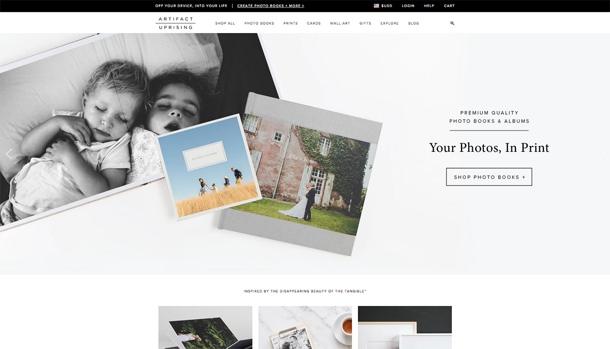
This is a modest designed webshop for photo products. Because the website is so minimalistic, it has a very peaceful appearance. The large header however makes sure that it’s not a boring website. The little pictures in the submenu’s also make the website more vividly and help to quickly click through to following pages. (http://www.artifactuprising.com/)
Stockbroke Yacht Brokers
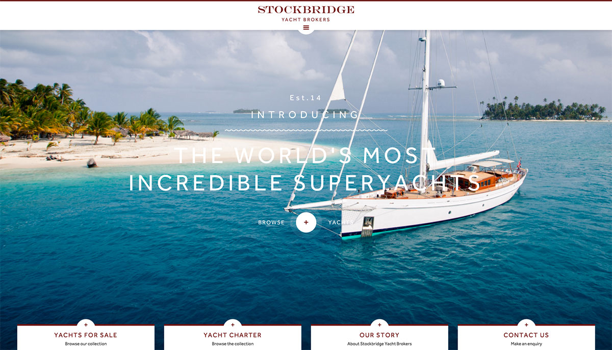
This website gives with big, sharp background pictures an impressive welcome, which can be expected from a yacht website. Because the pictures zoom in slowly, the website comes more alive. The big buttons on the bottom of the website help to quickly navigate to the following pages. On the following pages a very user friendly filter allows you to make a selection in the yachts collection. Also with this website the strength is in the simplicity. Everything is tight designed in blocks and that gives it a clear overview, making it easy to navigate and to find the information you’re looking for. (http://www.stockbridgeyachts.com/)
Elm Coffee Roasters
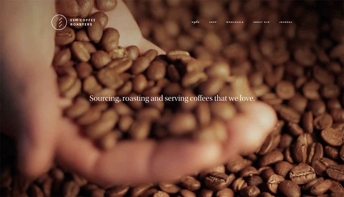
In a selection by Webpuccino® you can of course expect a coffee website. The website of these coffee roasters gives with a big background video a short introduction in their coffee place, like you’re walking around there. The rest of the website is pretty straightforward designed with big blocks and a simple layout. The about us page is a little more playful with some free elements and that helps to stand out from the tight design. (http://elmcoffeeroasters.com/)
Caffe Cimo
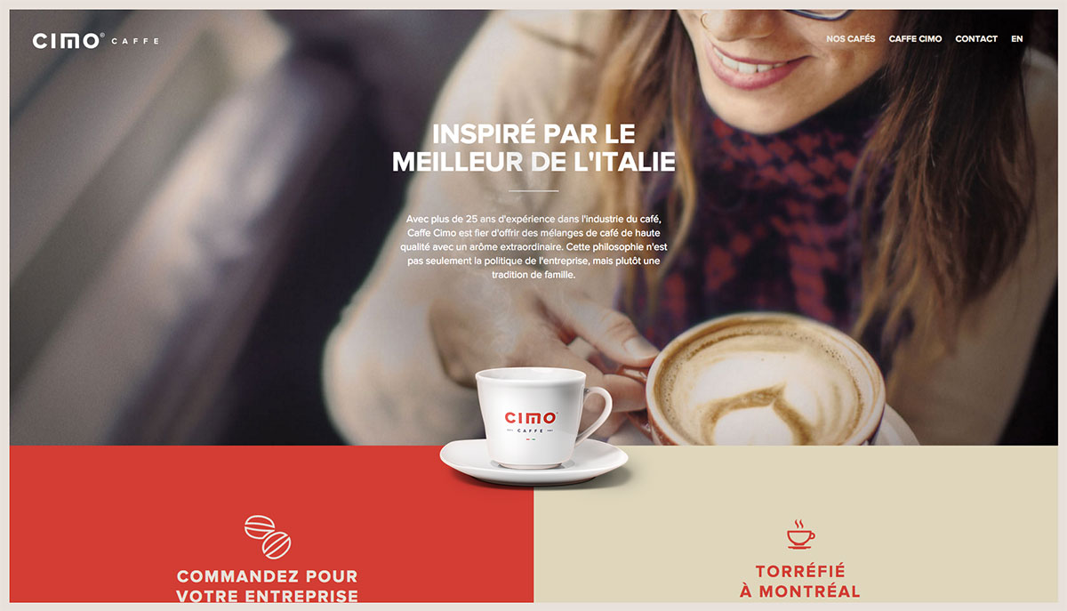
This is another website that immediately gives you the experience of coffee. On the homepage there is a hot cup of coffee waiting for you under which there are big blocks to help navigate the website. Alternating the big blocks with free-standing product pictures brings variation to the pages and makes sure the website is uncluttered, but not boring. (http://www.cafecimo.com/)
Pierre’s Ice Cream
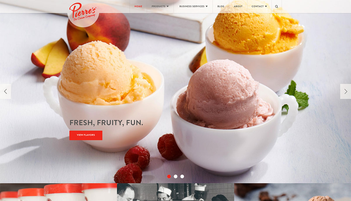
As desert is here a beautiful ice cream website. With big pictures of delicious ice cream this website seduces you to hang around for a while. The big picture blocks and half transparent menu on the top of the page help to navigate the website fast. The beautiful free standing product pictures invite to be clicked on and several animations everywhere make the website complete. (https://pierres.com/)
